Saturday, February 27, 2021

US Treasury Notes vs. Gold: Knowing the Price of Everything and the Value of Nothing

According to Marketwatch, from the beginning of 2021 through February 26, 2021 the price of gold has declined approximately 9%, and for the week of February 22, 2021 its price declined about 2.8%. On the other hand, during the same time frame, the 10-year US Treasury Note yield has increased from 0.917% to 1.415%. This increase in bond yield has put downward pressure to gold prices, given that it is a non-yielding asset.  

It is widely reported that the increase in bond yields is the result of positive expectations that the economy will improve at a faster pace than initially thought. Following the conventional economic logic of this argument, as the economy improves faster than expected, general pressure in consumer prices will increase, which leads to inflationary pressures and thereby increasing the premium in bond interest rates. Viewed from a different perspective, when we look at the 10-year Treasury Inflation-Indexed Security (TIPS) we see that at the beginning of 2021 it stood at -1.08% and as of 2-25-2021 the rate stood at -0.60%. Negative TIPS rates mean that when the principal is paid it is adjusted downward and obviously interest payments are less than they would be otherwise when compared to a regular bond. Currently for TIPS, if at maturity the adjusted principal is less than the original principal, the government will give you the original amount invested. Nevertheless, the point made here is that at this moment, based on TIPS rates there is an expectation of consumer prices increasing, which as I have said earlier it is because there is an expectation of improved economic conditions happening more quickly than initially believed.

Based on my view, however, the economic improvement currently underway is the result of increase “opening” of the economy from government lockdowns. Coupled with massive liquidity injected by government authorities, it is giving the illusion of prosperity. Like a massive Ponzi scheme, only more debt will sustain the illusion. But like all illusions, when reality sets in there will be a massive amount of disappointment. The market’s pullback from the last couple of days is merely a canary in the coal mine. No one knows the day and time when reality will set in, but in the meantime you would be wise to consider what I shared earlier today.

Rendezvous With Destiny - by Bill Bonner

Note: The following is an excerpt of a commentary written by Bill Bonner, a legendary investor and market commentator who everyone needs to hear. The original is here. He provides some good insight and appreciation of our current times with respect to historical standards. You would be wise to consider what he says and plan accordingly.

*******************************

Rendezvous With Destiny

Cycles take time. The credit cycle, for example, can last a lifetime. The last time interest rates were this low was around the time we were born – in the late 1940s.

A complete stock market cycle, too, is surprisingly long. But we have to look at them in terms of old money – the gold-backed dollar – to see them clearly.

The last major low came in 1980. Then, it took only 1.3 ounces of gold (equal to about $700 at the statutory rate) to buy the entire Dow 30 stocks.

Twenty years later, the bull market had run its course, hitting a high of over 40 ounces of gold in 2000. That was the high-water mark for U.S. stocks. They had never hit such a high before… and never have again since.

image

[For more on the Dow-to-Gold ratio, click here.]

And there’s still no bottom in sight, 40 years after the last low.

Investors and the financial press applaud every up move in the stock market. “Dow 30,000,” they cheer.

But to get back to its real level of 1999 – at 42 ounces of gold to buy the Dow – it would have to go to 67,000.

Even as stocks go up in new, nominal dollars, gold goes up more, leaving them further behind.

And our guess is that this pattern will continue, too… and when the Dow finally finds its bottom – its rendezvous with destiny – it will be under 5 ounces of gold.

End of an Empire

According to Sir John Glubb, the imperial cycle lasts 250 years.

Maybe so. Maybe not. But the U.S. empire definitely seemed on the downswing after 1999. And once the cycle turns, none of the king’s horses and none of his men are able to do much about it.

That is a recurring pattern of history, too – like it or not, empires die. All of them.

We have been chronicling the many promises of the 21st century that didn’t pan out.

The dot-coms blew up in March 2000.

The Information Revolution buried us under a mountain of data.

The stock market headed down… and in real terms, is still only at half its 1999 level.

The mission, whatever it was, was never accomplished in Iraq.

The war in Afghanistan has turned into the longest ever. The U.S. military still hasn’t won a war in 75 years.

New technology failed to produce a new boom.

The most aggressive Federal Reserve response ever (to the crisis of 2008-2009) yielded only the weakest recovery on record.

The Obama election failed to heal racial wounds.

The Trump tax cut failed to increase growth.

The Trump trade wars made no appreciable improvement in America’s manufacturing sector.

And the Baltimore Ravens did not win the Super Bowl in 2020.

The seasons change, in other words… even for empires.

Disappointments accumulate.

And MAGA never had a chance.

Regards,

signature

Bill

Thursday, February 25, 2021

ECB and BOJ Balance Sheet – Other Beasts

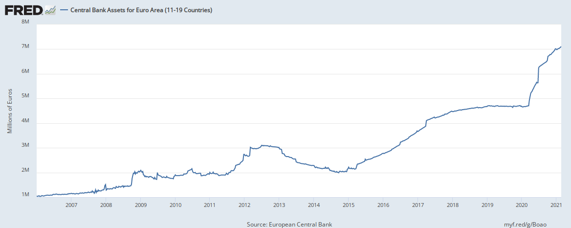
I have written about the FRB’s monstrous balance sheet, which quite frankly has ballooned by about 80% since February 2020. The reality is that both the European Central Bank (ECB) and the Bank of Japan (BOJ) has not lagged far behind. As noted in the graphs below, the ECB’s and BOJ’s central bank assets have increased 50% and 22% respectively since February 2020. These staggering figures all combined have led to an overabundance of liquidity in world markets – which is no surprised why we have seen a sharp upswing in world equity prices since 2Q2020. Despite the market sell-off today (2/25/2021), liquidity is still ample to buoy the current markets run. But my previous warnings still apply: do not be caught off guard during the coming storm.

ECB


BOJ


Wednesday, February 24, 2021

Margin Accounts at Brokers and Dealers

A not well-known metric that gives some insight into the health of the equity market is the margin accounts at broker and dealers. These are loans made by brokers and dealers to households to meet margin calls, which happen when a customer’s account value declines below some required level set by the broker or dealer. Generally speaking, in times of exuberance, loans are more easily extended; and in times of panic, loans contract. That is what you see when looking at the chart below showing the trend for the last 20 years. At the moment, exuberance is evident and so loans have been increasing. This chart, which is indexed to March 2001 as the base (i.e. = 100) gives further support as to why the stock market has made strong moves upward.


But a word of caution is warranted: This is a quarterly metric, so the lag is quite pronounced given that the last data point is as of 3Q2020. I am looking forward to see what the next data release next month will show. My expectation is an increasing value, given the general low interest environment.

Tuesday, February 23, 2021

How well statistics work: a lesson learned from Pfizer Covid Vaccine

Today I deviate somewhat from the financial markets to bring forth a relevant point that equally translates from the medical field. We look at the reported effectiveness of the Pfizer Covid vaccine. Please be advised that I do not have a personal opinion on the vaccine’s effectiveness; however, I merely report what it has been less obvious when reading the government data.  Here I will take you through the process by which the reported effectiveness is derived and how it might not necessarily be obvious from the initial CDC reports.

 The CDC states that “based on evidence from clinical trials the Pfizer-BioNTech vaccine was 95% effective at preventing laboratory-confirmed COVID-19 illness in people without evidence of previous infection.” How was this 95% effectiveness derived? Here is the short answer: by a mere 170 patients! However, you will have to dig, critically analyze written statements, and cross-reference to other medical materials to clearly see that answer.

The point above from the CDC is linked to its Morbidity and Mortality Weekly Report where it explains in further detail how the 95% effectiveness is derived. Specifically, the relevant section (copy/pasted below in italics and in parenthesis) states the following [with my comments in brackets]:

“The body of evidence for the Pfizer-BioNTech COVID-19 vaccine was primarily informed by one large, randomized, double-blind, placebo-controlled Phase II/III clinical trial that enrolled >43,000 participants (median age = 52 years, range = 16–91 years) (5,6).”

[My Comment: 43K seems like a large number of people tested for a vaccine.  My mind thinks: this number of people from where the 95% effectiveness was derived.]

“Interim findings from this clinical trial, using data from participants with a median of 2 months of follow-up, indicate that the Pfizer-BioNTech COVID-19 vaccine was 95.0% effective (95% confidence interval = 90.3%–97.6%) in preventing symptomatic laboratory-confirmed COVID-19 in persons without evidence of previous SARS-CoV-2 infection.”

[My Comment: Here is the first catch: how many “symptomatic laboratory-confirmed COVID-19 in persons without evidence of previous SARS-CoV-2 infections” are we talking about? If they clearly call out this group, it must mean that the 43K sample noted previously included people who were infected or had been infected, or were not able to be determined. Nowhere in the CDC article are we told the number of “symptomatic laboratory-confirmed COVID-19 in persons without evidence of previous SARS-CoV-2 infections”]

“Consistent high efficacy (92%) was observed across age, sex, race, and ethnicity categories and among persons with underlying medical conditions.”

[My Comment: Presumably, this is representative of “symptomatic laboratory-confirmed COVID-19 in persons without evidence of previous SARS-CoV-2 infections”.]

“Efficacy was similarly high in a secondary analysis including participants both with or without evidence of previous SARS-CoV-2 infection.”  

[My Comment: Here is another clue leading us to conclude that the 43K sample included a mixed bag of people who were exposed to COVID. But, again, nowhere in the CDC article are told of this breakdown.]

With that background and question at hand, namely, how many “symptomatic laboratory-confirmed COVID-19 in persons without evidence of previous SARS-CoV-2 infections” are there, we went to The New England Journal of Medicine where they clearly state that “[t]here were 8 cases of Covid-19 with onset at least 7 days after the second dose among participants assigned to receive BNT162b2 and 162 cases among those assigned to placebo; BNT162b2 was 95% effective in preventing Covid-19 (95% credible interval, 90.3 to 97.6).”

When you divide the 162 who did not get COVID by 170, and then multiply by 100, you then get the 95% vaccine effectiveness that is being widely reported. It is not, as you might be led to conclude, based on the 43K total being reported in the CDC article.

Lesson Learned: Always check the data and the critically think through categorical statements being made.

Monday, February 22, 2021

Money Multiplier: A Warning Sign to the Stock Market

I have written about the exorbitant expansion of the FRB’s balance sheet. An equal important measure is how fast that money injection is multiplying in the economy. Putting it simply, when the FRB injects money in the economy it ends up creating additional money via the banking system. For example, assume the FRB injects $100 in the economy, and assume that banks are required to hold 10% on demand and lend the rest, that would translate in an additional $900 dollar created out of thin air ([100/0.1] – 100). In this example, the money multiplier would be 10%. In the real world there are other variables to consider, but broadly speaking, the example is indicative of how the money creation process works and the importance of taking into account the rate of multiplication. It goes without saying that the extra funds created would chase other goods, and what we would expect to see is prices rising somewhere in the economy. And this is what we have seen starting about May 2020. I have estimated the money multiplier as the ratio between M1 and the Monetary Base. 

The graph below shows you the time period from April 2018 to the present. What is obvious that the money multiplier was picking up speed during most of 2018, which fueled the stock market bull run prior to the government-induced shutdown of the economy. The economic shutdown had the obvious effect of decelerating the money multiplication process. But what becomes obvious is that the money multiplier has picked up speed in particular during the latter part of 2020. This has translated at present in record setting numbers in the equity market. It is critical to understand that the money multiplier metric is backward-looking, so we must make some sort of assumption about the future. What we know is that the money creation process is still continuing and that gives support to the continuing rise of the equity market in the very short term (which I define here in the next 2 months), all things being equal. However, as this rate continues to decline, it will be another sign that a correction in prices is soon coming.  

Money Multiplier


Data Source: FRB's H.6 Statistical Release

Saturday, February 20, 2021

Federal Debt Held by Private Market

Expanding from a previous post, it is concerning to observe the increase of public debt monetization by the Federal Reserve. Put differently, the private market holding of the public debt, based on rough estimate, has been on a general decline. As noted from the Table below, the estimated share of debt held by the public as of 2/18/2021 is about 53%, some 8% decline since September 2020. Now, the precision of these amounts are less of a concern, given that by the time this post is published or read, the amounts will have changed. What matters is the trend. And here we are seeing that the additional debt being issued is being gobbled up by the Central Bank at a faster rate when compared to the private market. At the logical extreme, the FRB will at some point be the only buyer in the market. But before that actually happens, expect yields to increase to account for the increase in counterparty risk.

[In billion of dollars] 


*Total Privately Held has been adjusted to reflect FRB holdings, as reported by the FRBNY. February 2021 amounts obtained from US Treasury. Other amounts in Table come from US Treasury report, Table OFS2.