Monday, February 14, 2022

What is the US Treasury Yield Curve saying?

Yield curve inversion occurs when short-term rates are higher than the long-term rates. Historically, this has been a predictor of recessions, which it is normally witnessed within a year after the inversion occurs.

Banks typically make money when borrowing money at the short end of the yield-curve and lending at longer end of the curve. In other words, they borrow at a lower rate than what they lend, netting the difference. An inverted yield curve is generally not good news for banks. 

At the moment, based on the yield curve rates reported on February 14, 2022, I do not see evidence of an inverted yield curve when measuring the difference between the 30-year rate and the 3-month rate. 
Saturday, February 12, 2022

What are US Treasury interest rates telling us?

The short answer is a mixed one. 

Let’s take a look at the 2-year Treasury yield from February 11, 2021 and compare it to its yield noted for the latest available data as of February 11, 2022. Last February’s yield stood at 0.11% and it now stands at 1.50%. Based on those numbers, we can say that the upward pressure in rates could come from the inflation premium. 

However, when we look at the longer-end of the yield curve, namely the 30-year bond, we get a different picture. On February 11, 2021 the 30-year yield stood at 1.94%, and it now stands at 2.24%. In addition, the yield was essentially flat during this week – one in which inflation fear spiked after the printed CPI stood at 7.48%.  This tells us that inflation risk has not yet gotten out of hand. It tells us that market participants still believe that the Federal Reserve will succeed in taming the increases in prices. 

Pay attention to the 30-year bond. It will give you a pulse of what the market really things about inflation risk.  

Thursday, February 10, 2022

Median CPI for January 2022: Worsening Trend

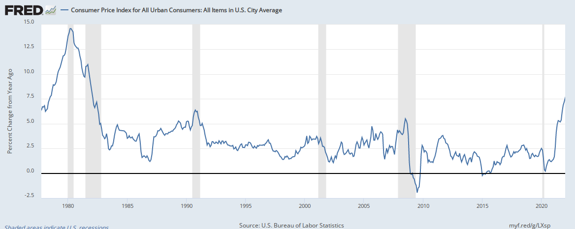
Today’s headline CPI for the month of January 2022 was reported to be at 7.48%, the highest it’s been over the last decade. In fact, you would have to back to 1982 to find a similar figure. This is what the headline CPI looks like since 1980:


But in order to get a real sense of what is happening in the inflation front, we have to look under the hood. The median CPI gives us that measure. Aggregates measures are inherently imprecise, because it is trying to capture the average consumer, but in doing so it will by nature miss what is happening on a person-by-person basis. At any rate, we need something as a measurement tool. This is what the median CPI (orange line) looks like when compared with other cuts of the CPI:


The trend is obvious. It is upward. It is not letting up. 

Are supply chains the main contributor to this rise? Is the loose monetary policy the culprit? I think both. It looks like the Federal Reserve Bank will be pressured to raise interest rates quicker and perhaps in greater amounts than initially forecast.

Saturday, February 5, 2022

Money flowing out of risky investments: What does it mean?

Money flowing out of risky investments: What does it mean?

Money continues to flow out of the riskier side of bonds. Take a look at this chart: 

As can be seen, the amount of money being pulled out from US high yield bonds has been on a downward trend for the last four months. This has not happened over the last year.

What does this mean? For one, the dumping of riskier debt means that investors are growing risk-averse and putting money in safer investments. More broadly, the movement away from high yield bonds could mean that market expectations are shifting towards safety, as general market risk continues to increase. Will the trend reverse? Only time will tell.