Saturday, September 26, 2026

The Art of Plausible Deniability in Market Commentary

I recently read an opinion piece in the Financial Times arguing that 5% is the "magic number" for the U.S. 10-year Treasury yield and that yields are unlikely to move sustainably higher. The writer is Karen Ward, who is the chief market strategist for Europe, Middle East and Africa at JPMorgan Asset Management.

Karen framed the discussion around three arguments for higher yields:

1. AI-driven productivity gains have raised the neutral rate of interest.

2. Investors should demand a larger premium because of deteriorating U.S. fiscal policy.

3. Bonds have lost their diversification benefits.

What struck me was that the author treated these three arguments very differently.

For the first argument, she discussed why AI productivity gains would need to be exceptionally large to justify materially higher yields and pointed to signs that higher rates are already affecting the economy. However, she never clearly stated, "I am skeptical of this view." The reader is left to infer her position.

The second argument was similar. She acknowledged that U.S. fiscal policy likely deserves some additional risk premium, but then emphasized the Federal Reserve's credibility in controlling inflation. Again, she never directly stated whether she believed fiscal concerns were large enough to drive yields materially higher. Here again, we are left to wonder what her stance is.

The third argument was different. There, the author explicitly stated, "This is wrong." She rejected the idea that bonds have permanently lost their diversification value, arguing that if the AI boom weakens and growth slows, Treasuries could still provide significant portfolio protection through falling yields and Fed rate cuts. To me, there is nothing particularly revelatory about her observation because that is largely what has transpired in recent years, although I would argue that this view rests on shakier foundations than many investors assume.  

Let’s go back to her points. Note the asymmetry in treatment for each one. Given that the author is a chief strategist at a large asset manager, this may not be accidental. Institutional market commentary often leaves room for multiple outcomes. Strongly rejecting an argument can be costly if events later prove otherwise.

The important takeaway of Karen's view is that it's broadly representative of the prevailing Wall Street narrative that yields are approaching a ceiling and are unlikely to move sustainably higher. However, it largely dismisses the fact that Treasury yields have been on a sustained upward trajectory since 2020. In April 2020, the 10-year Treasury yield was roughly 0.61%, and by September 24, 2026, it had risen to 5.18%. I do not yet see evidence that the forces driving higher yields have gone away.

Conclusion:

Beware when reading market views of institutional players because incentives may be misaligned. That does not mean that the analysis is wrong, but incentives are a big deal to determine credibility. When a strategist at a major institution publishes an opinion piece, from their perspective there is often value (incentives) in leaving room for multiple outcomes.

As an independent observer, my incentives are gaining wisdom, knowledge, and understanding and conveying what I see to the broader public. Unlike institutional strategists, I am not tasked with representing a large asset-management business.

There is nothing magical about 5%, or 4.99%, or 6%. People (or the markets) give meaning to those numbers. What matters is the trend. As I've pointed out previously, the upward trend in yields remains firmly entrenched. Given the amount of liquidity and fiscal spending in the system, I believe it will become increasingly difficult for the FOMC to prevent bond vigilantes from demanding higher yields.

Thursday, September 24, 2026

Record Emerging Market Debt Issuance: Opportunity or Warning Sign?

Emerging markets have issued a record amount of foreign-currency debt this year despite higher global interest rates and a stronger U.S. dollar. Is this a sign of confidence, or are investors overlooking risks that have repeatedly surfaced throughout history?

My latest note explores some drivers behind the issuance boom and the lessons from past emerging market debt crises:

https://uncommoninsight384054130.wordpress.com/2026/09/24/not-all-is-well-a-tale-of-emerging-market-debt/

Surging government bond yields raise alarm

The era of ultra-low interest rates is over, but global debt continues to grow. With G7 bond yields at their highest levels since 2008 and debt-servicing costs climbing, policymakers and investors are increasingly worried about sustainability. 

Read my brief note on one of the most important macroeconomic challenges facing the world today:

https://uncommoninsight384054130.wordpress.com/2026/09/24/surging-government-bond-yields-raise-alarm/


Wednesday, September 23, 2026

Late‑Cycle Financial Engineering: Are CFOs and NAV Loans the Canary in the Coal Mine?

The Financial Times just highlighted the surge in CFOs and NAV loans, two complex instruments that echo the financial engineering we saw before 2008. These markets have grown several‑fold since 2021, despite being opaque and difficult to price. To me, they signal that we’re deep into the late stages of this financial cycle.

I break down the data, the risks, and the historical parallels on my WordPress blog here:

https://uncommoninsight384054130.wordpress.com/2026/09/23/late-cycle-financial-engineering-are-cfos-and-nav-loans-the-canary-in-the-coal-mine/ 

Tuesday, September 22, 2026

Inflation 101 – What is it?

Inflation is not “prices going up.” That is the symptom. The cause is far simpler: when money supply outruns the real economy, everything else follows. The data from 2016–2026 makes this impossible to ignore.

Go to my WordPress site to read the full post here:

https://uncommoninsight384054130.wordpress.com/2026/09/22/inflation-101-what-is-it/

Saturday, September 19, 2026

Economic Risk Dashboard: A Framework to View the US Economy

This post introduces a practical dashboard for assessing the health of the US economy amid an age of deep uncertainty. By monitoring foundational indicators across household strength, credit markets, and consumer confidence, the framework offers a structured way to interpret where we may be in the economic cycle. Yet the analysis also acknowledges a critical truth: numerical metrics, while useful, are judgmental representations of reality. They cannot replace wisdom, knowledge, and understanding, which require a deeper philosophical view of how economic life actually works.

Go to my WordPress site to read the full post here:

Friday, September 18, 2026

Housing Prices and Mortgage Rates – Where Do We Go From Here?

I was curious to see what has been the relationship of house prices and mortgage rates over the last decade, starting in February 2026. I went to the St. Louis Fed Fred tool to observe the relationship between the S&P Cotality Case-Shiller U.S. National Home Price Index and the 30-Year Fixed Rate Mortgage Average in the United States. To clearly see the movement, I rebased both metrics to the same date and year (February 2016) to compare their levels.

As can be seen in the graph below, home prices rose dramatically and steadily from 2016 through 2022, while mortgage rates stayed low and stable; but once mortgage rates spiked in 2022, home‑price growth flattened sharply, showing that the affordability shock effectively halted further appreciation even though prices did not fall.

        Source: https://fred.stlouisfed.org/graph/?g=1YL3Q

The divergence between the two lines, i.e., mortgage rates rising sharply while home prices remain elevated, captures the core dynamic of the current housing market: demand is constrained by financing costs, but supply remains too tight for prices to correct meaningfully.

If mortgage rates continue to rise from here, three broad scenarios emerge in my view:

Scenario 1: A modest rate increase leads to a national flat‑line in home prices, with only regional declines.

Scenario 2: A sharper rate increase produces mild national price declines as affordability deteriorates further.

Scenario 3: Rising rates combine with rising unemployment, creating an environment where meaningful nationwide price declines occur.

I am forecasting a recession in the next 6 to 12 months. Because of that I believe that the economy will eventually reach this third scenario, but without a repeat of the 2008–2010 housing crisis, because today’s market lacks the extreme leverage, speculative inventory, and credit‑quality deterioration that defined that period.

Thursday, September 17, 2026

September 2026: What the Federal Reserve Thinks About the Broader Economy

Here is a graph courtesy of the Financial Times that shows what the member of the Federal Reserve who vote on interest rates think about the broader economy.

A few things stand out:

  • Most officials cluster around the 4% range for 2026 and 2027. This means that there is broad consensus that rates will not fall quickly and it is the Fed’s way of quietly signaling that the era of 0 to 2% rates is over.
  • The longer-run dots are creeping upward, sitting mostly above 3%. This implies that the Fed believes the economy can sustain higher rates without a recession.
  • Core PCE inflation expectations for 2026 have risen, which means that Fed officials believe inflation will be more persistent than previously thought. The Fed here is signaling to expect a slower return to their prefer target of 2%. The 2027 inflation line is flatter, meaning that Fed officials think inflation will eventually ease, but gradually.
  • The GDP line shows that Fed officials believe growth is expected to be modest, but stable. And the unemployment line staying near 4% tells us that the Fed thinks that the labor market will remain tight.

Putting this all together, the charts show that Fed officials expect interest rates to stay higher for longer, inflation to be stickier than previously assumed, GDP growth to remain modest, and unemployment to stay low. The combination signals a central bank that sees persistent inflation pressures and no imminent recession, which is why the rate path is flatter (i.e., no sharp cuts expected) and elevated (the longer‑run neutral rate drifting above its historical 2–2.5% range).

Monday, September 14, 2026

Inflation Fears: The Reason Why Interest Rates are Climbing Now

In an article published today (September 14, 2026) by the Financial Times we read that the 10-year US Treasury Bond reached 5% during the trading session. “The yield rose 0.04 percentage points to hit a high of 5.01 per cent in morning trading on Wall Street, before easing back to 4.98 per cent.” As can be seen from the graph below, the yields have hit a peak not seen since 2023 and prior to that you have to go back to the Great Financial Crisis period to see such a rate:

              Source: Financial Times
 

A Quick Primer on Nominal Interest Rates

Nominal interest rates are driven by inflation expectations and a term premium. Nominal rates start with the real interest rate, which is driven by economic growth, demand and supply of loanable funds, etc. The market then adds an inflation expectation percentage amount and a term premium amount to the real interest rate to come up with the nominal interest rates we see reported. Inflation expectations have to do with average expected inflation over the time horizon of the fixed income instrument. Term premium includes an additional element to account for the fact that the inflation expectation can be wrong. In other words, inflation expectation has to do with mean (average) expectation and term premium includes some percentage amount to account for the variance deviation of that expectation.  

Inflation Up Interest Rate Up

Let’s take a look at a metric that gives us a glimpse of inflation expectation. Below you’ll see the 5-year forward inflation expectation rate, which is a metric that the Federal Reserve Board monitors as part of their dataset to determine monetary policy.

        Source: Federal Reserve Bank of St. Louis, 5-Year, 5-Year Forward Inflation Expectation Rate [T5YIFR], retrieved from FRED, Federal Reserve Bank of St.                Louis; https://fred.stlouisfed.org/series/T5YIFR, September 14, 2026.
 

You can clearly see the upward trend in inflation expectation being driven by oil price spikes resulting from the Iran War.

Making matters a bit more concerning is that the longer the elevated oil prices are maintained it will inevitably disrupt the term premium element of inflation and hence pushing upward pressure in nominal interest rates. That will have knock-on effects impacting economic growth expectations, fiscal deficits, and total government debt. Against this background, it would not be at all surprising if the Federal Reserve Open Market Committee (FOMC) decides to increase its target federal funds rate this coming week (to be announced on Wednesday, September 16).

Saturday, September 12, 2026

September 2026 Equity Valuations: Above Trend and Beyond Normal Bounds

Let’s look at the broad level graph of the monthly close for the Dow Jones Industrial Average over the last 10 years (as of September 11, 2026), as reported by MarketWatch.


Starting from the low observed on March 1, 2020, the DJIA stood at 21,917. The most recent value for DJIA as of September 11, 2026 is 52,573. The total return during this time is 140%, and if we were to annualize the return, you are looking at a rate of 18.6% (you calculate it by dividing the most current value by the previous value, and then raise the result to 1 divided by time in years, and then you subtract 1 from that result, and then you convert to percentage by multiplying by 100).

Doing the same for the S&P 500, we observed a similar elevated return profile.


Starting from the low observed on March 1, 2020, the DJIA stood at 2,584. The most recent value for DJIA as of September 11, 2026 is 7,656. The total return during this time is 196%, and if we were to annualize the return, you are looking at a rate of 20%. This is almost double the historical standard over the last 50 years. I intentionally anchored the analysis at the March 2020 COVID low because it captures the full effect of the fiscal and monetary interventions that reshaped the post‑pandemic market environment. While this starting point inflates returns relative to neutral baselines, it is appropriate for evaluating the consequences of policy actions on equity valuations.

If the S&P 500 had grown at its historical long-term rate of approximately 12%, the index would be around 4,600 today (=(1.12^6.534)*2,584). In other words, the S&P 500 is about 66% (=(7,656 – 4,600)/4,600) above where long-term historical compounding would place it. All this indicates that we are in bubble territory. The question then is not if there will be a reversion to the mean, but rather how that will manifest.

A word of caution is warranted: As J.M. Keynes stated, “markets can remain irrational longer than you can remain solvent.” Although we cannot pin-point the exact day that the mean reversion will occur, I do believe we can know the season (i.e. time range) when that will happen. We will explore that in a future post.

Saturday, May 13, 2023

FDIC Bank Failures: What the Numbers Look Like

Here is a brief illustration of the number of bank failures that I calculated per the FDIC public listing.


This metric is a lagging indicator of economic downturn, as you can see from the years preceding the last Great Financial Crisis of 2008 – 2010. It’s also a lagging indicator when the economy has begun to improve. Said another way, the years preceding an economic downturn is marked by a relatively low number of bank failures; and the years after the economy has begun to improve there is still relatively high number of bank failures.


Saturday, April 29, 2023

Price Stability in a Fixed-Money System

This is a follow up topic discussed in a previous post about economic theory with respect to  monetary systems, particularly a fixed-money system. Here is the question that was asked:

How does a fixed-money system limit variability in prices of good, when price variability is inherent to commodity-based, fixed-exchange monetary systems and when the pre-Fed era saw more variability in price?

A fixed-money system (e.g. gold-standard) does not limit price variability of goods. Price stability is not necessarily linked with a fixed-money system (e.g. gold-standard); variability of prices is part of any economy. At a basic level, all prices depend on the law of supply and demand; and that depends on the productive capacity of a society. As output increases, assuming a stable supply of money, then you’d see prices of goods decline (less money chasing more goods). What does this mean? It means the standard of living is increasing.

Now, with respect to the prices of gold, don’t take my word for it, look at this table published by the National Mining Association listing the historical average price of gold (http://www.nma.org/pdf/gold/his_gold_prices.pdf):

Pre-Fed era, price of gold in 1833 = $18.93; and price of gold in 1913 = $18.92.

Post-Fed era, price of gold in 1914 = $18.99; and price of gold today (as of 4/28/23) = $1,999.

Saturday, April 22, 2023

Treasury Bills Yields: Why Has the 4-Week Bill Rate Fallen

First, let’s take a glance at the current conditions surrounding the Treasury yield curve. Here are two points in time – March 1, 2023 and April 21, 2023. We compare the spread of the various Treasury maturities vs. the 10-year Treasury

Date

1 Mo

2 Mo

3 Mo

4 Mo

6 Mo

1 Yr

2 Yr

3 Yr

5 Yr

7 Yr

4/21/2023

0.21

(1.41)

(1.57)

(1.62)

(1.50)

(1.21)

(0.60)

(0.32)

(0.09)

(0.05)

3/1/2023

(0.66)

(0.81)

(0.89)

(1.01)

(1.19)

(1.05)

(0.88)

(0.60)

(0.26)

(0.16)

Source: https://home.treasury.gov/resource-center/data-chart-center/interest-rates/TextView?type=daily_treasury_yield_curve&field_tdr_date_value=2023

On March 1st, the 4-week Treasury Bill rate was 0.66% higher than the 10-year Treasury rate. As of April 21st, the 4-week Treasury Bill rate was 0.21% lower than the 10-year Treasury rate.

Now, let’s take a look at the trend of the 4-week Treasury Bill rate since March 1, 2023:


We can clearly see that after March 31, the trend has been clearly on a downward path.  

Fundamentally all prices follow the law of supply and demand all things being equal, the higher the demand, the higher the price; conversely, the lower the demand, the lower the price. Incorporating the supply side of the analysis, the same demand outcome will occur if supply is either held constant or increased at a slower pace than demand.

At a basic level, what we have seen for the 4-week Treasury Bills is that the demand of loanable fund from the government has declined, but the amount of money that the public has supplied hasn’t fallen at an equal or higher rate. Put another way, while the offering amount (supply) to sell Treasury Bills has fallen, the demand to purchase hasn’t fallen as much. That is, demand exceeds supply. And in the context of Bills (or any fixed income security for that matter), higher Bill prices means lower interest rates. You can see this by looking at the auction amounts from 4/20 and 3/2:

Auction Date

Offering Amount

% Change In Offering Amount

Total Tendered

% Change In Total Tendered

4/20/2023

50,000,000,000

-33.33%

150,597,577,600

-20.56%

3/2/2023

75,000,000,000

-

189,563,268,500

-

In the broader context of total government debt, the total debt held by the public has declined by approximately $24 billion since March 1, 2023; and the total government debt has increased only by approximately $1 billion, which is low, say if you compare the Feb 1 to March 1 period when total debt held by the public and the total government debt increased by approximately $23 billion and $4.5 billion respectively. Currently (4/20) total government debt stands at $31.45 Trillion.

The question then becomes why the decline? The answer lies in the current “debt limit”. By law the government is only able to borrow a maximum of approximately $31.4 Trillion. Currently (4/20) total government debt stands at $31.45 Trillion. The way the government is getting around to continue to borrow is to use what’s called “extraordinary measures”, which it can only legally do for a certain period of time. Right now the government can only borrow those funds that mature. For example, if only $50 billion of 4-Week Treasury Bills are due to mature, that’s the maximum the government can offer to purchase. That is ultimately the reason why the interest rate of Treasury bills have declined (i.e., higher demand and lower supply of T-bills).

Economic Framework to Understand Boom-Bust cycle

Introduction:

The following series of notes represent the outcome from dialogue had with respect to the theoretical economic frameworks. This is important to understand because how we think about economic systems – which all are inherently complex – will help us forecast where it is heading. In other words, having proper perspective of the way things should be and the way they are now helps us frame the present circumstances in such a way that we can understand (or at the very least try).

The following perspective is merely a point of view and do not claim to be perfect. My goal is that it will be taken as a means to stimulate dialogue and thought.


Topic 1. If a fixed-money system limits the boom-bust cycle, why did the more fixed-money systems of the pre-Fed era have so many more booms, busts, panics, and depressions?

Three points on this question:

- First, all man-made systems are imperfect, so no man-made system will prevent “boom, busts, panics, and depressions” from occurring.

- Second, without going into the rabbit hole of precisely defining each term, yes, the pre-Fed era had “boom, bust, panics, and depressions.” But to say that there were more or less, masks some important distinctions: pre-FED, “booms, busts, panics, and depressions” were for the most part parochial, both in location and/or markets (e.g. the railroad investment mania of the 19th century had little impact on the average person and impacted mostly the investor class). It is not the number of “booms, busts, panics, and depressions” that is germane, what is important is their magnitude. Read economic historian Charles Kindleberger’s Manias, Panics, and Crashes. His classic book goes through the history of manias, panics, and crashes, and then lists the top 10. If my memory serves me right, 8 out of the 10 crashes occurred post Fed era. At the time the book was written, the crash of 2008 had not happen, and most certainly that one would have made the list. Let’s put aside the 2020 crash due to the lockdown, as that was a very unique event in human history, what becomes apparent is that each successive crisis post-Fed era are more pronounced and impact is broader (aka contagion risk).   

- Third, as briefly mentioned in my second point, a fixed-money system would limit the boom-bust cycle, but mainly in the context its broad economic impact. I do not know the exact number of boom-busts in the pre-Fed era, but what I am certain is that you will rarely see a boom-bust, say, in the likes of the ‘Great Depression’ or ‘Great Recession’. What you will find in the pre-Fed era are many localized issues (e.g., bank runs in the specific regions; or investment crashes that would impact the money centers without much impact to the broader population, etc.).

Monday, July 4, 2022

What’s Up and Down with Japan’s Economy

This post is simply to provide a brief explanation of what is currently happening with the Japanese economy.  As recent news have explained, there has been tremendous pressure in the Yen, which has caused it to depreciate relative to the US Dollar. For example, on January 1, 2022, you needed to pay about 115 Yen to purchase $1; and as of July 4, 2022, you now need approximately 135 Yen to purchase the same $1. This means that so far this year the Yen has lost about 17.4% in value relative to the Dollar.  At a basic level, the loss in value has to do with supply and demand issues: people are selling the Yen and buying US Dollars.

Why are people selling the Yen? Because investors have determined there are better returns in an alternative currency (i.e US Dollars). And right now, in terms of investment returns, the US provides an appealing opportunity. Japanese bonds (10-years) are currently paying somewhere in the neighborhood of 23 basis points – about 2.5% less when compared with similar US bonds. Furthermore, with consumer price inflation running hot and as a result the US Central Bank has begun to increase rates, this means that from an investment perspective US bonds are increasing their appeal. As such, people sell bonds and buy US treasuries – which essentially means selling Yen and buying Dollars.

This puts additional downward pressure in Japan for the demand of their bonds. This causes bond prices to fall, thereby increasing yields. On top of this market phenomenon, as part of its monetary policy, the Central Bank of Japan is committed to maintaining a maximum of 25 basis points for its 10-year debt. But as the bond selling pressure increases, the BOJ is doing what they can to assure that interest rates do not exceed the central bank policy target rate of 25 basis points. This means that any excess supply of debt, the BOJ is buying. And when the BOJ buys, it is increasing the money supply, which devalues the currency. It is becoming a pernicious cycle.

How long with the BOJ continue to do this? We don’t know for sure. What we do know with fair certainty is that what the BOJ is doing is not sustainable. Judging from prior history (see Asian Crisis of 1997-1998 to get a sense of what could unfold), we know that this will not end well.

Monday, February 14, 2022

What is the US Treasury Yield Curve saying?

Yield curve inversion occurs when short-term rates are higher than the long-term rates. Historically, this has been a predictor of recessions, which it is normally witnessed within a year after the inversion occurs.

Banks typically make money when borrowing money at the short end of the yield-curve and lending at longer end of the curve. In other words, they borrow at a lower rate than what they lend, netting the difference. An inverted yield curve is generally not good news for banks. 

At the moment, based on the yield curve rates reported on February 14, 2022, I do not see evidence of an inverted yield curve when measuring the difference between the 30-year rate and the 3-month rate. 

Saturday, February 12, 2022

What are US Treasury interest rates telling us?

The short answer is a mixed one. 

Let’s take a look at the 2-year Treasury yield from February 11, 2021 and compare it to its yield noted for the latest available data as of February 11, 2022. Last February’s yield stood at 0.11% and it now stands at 1.50%. Based on those numbers, we can say that the upward pressure in rates could come from the inflation premium. 

However, when we look at the longer-end of the yield curve, namely the 30-year bond, we get a different picture. On February 11, 2021 the 30-year yield stood at 1.94%, and it now stands at 2.24%. In addition, the yield was essentially flat during this week – one in which inflation fear spiked after the printed CPI stood at 7.48%.  This tells us that inflation risk has not yet gotten out of hand. It tells us that market participants still believe that the Federal Reserve will succeed in taming the increases in prices. 

Pay attention to the 30-year bond. It will give you a pulse of what the market really things about inflation risk.  

Thursday, February 10, 2022

Median CPI for January 2022: Worsening Trend

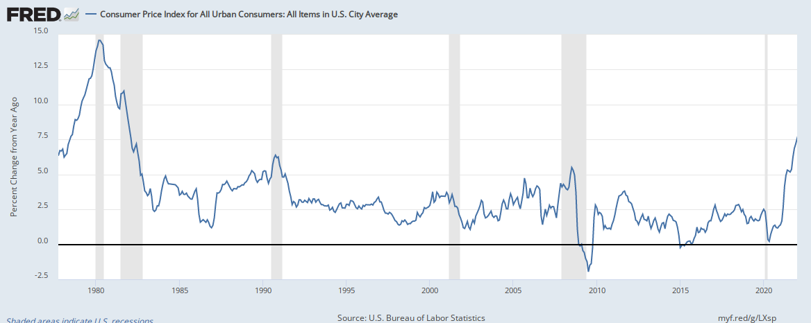
Today’s headline CPI for the month of January 2022 was reported to be at 7.48%, the highest it’s been over the last decade. In fact, you would have to back to 1982 to find a similar figure. This is what the headline CPI looks like since 1980:


But in order to get a real sense of what is happening in the inflation front, we have to look under the hood. The median CPI gives us that measure. Aggregates measures are inherently imprecise, because it is trying to capture the average consumer, but in doing so it will by nature miss what is happening on a person-by-person basis. At any rate, we need something as a measurement tool. This is what the median CPI (orange line) looks like when compared with other cuts of the CPI:


The trend is obvious. It is upward. It is not letting up. 

Are supply chains the main contributor to this rise? Is the loose monetary policy the culprit? I think both. It looks like the Federal Reserve Bank will be pressured to raise interest rates quicker and perhaps in greater amounts than initially forecast.

Saturday, February 5, 2022

Money flowing out of risky investments: What does it mean?

Money flowing out of risky investments: What does it mean?

Money continues to flow out of the riskier side of bonds. Take a look at this chart: 

As can be seen, the amount of money being pulled out from US high yield bonds has been on a downward trend for the last four months. This has not happened over the last year.

What does this mean? For one, the dumping of riskier debt means that investors are growing risk-averse and putting money in safer investments. More broadly, the movement away from high yield bonds could mean that market expectations are shifting towards safety, as general market risk continues to increase. Will the trend reverse? Only time will tell.

Saturday, January 29, 2022

Inflation has not reared its ugly head…yet!

This week the Federal Open Market Committee (FOMC), the arm of the Federal Reserve that conducts monetary policy, noted that “[w]ith inflation well above 2 percent and a strong labor market, the Committee expects it will soon be appropriate to raise the target range for the federal funds rate.”

During the Press Conference, FOMC’s Chairmen Jerome Powell noted that their aim is not to allow inflation to be entrenched. What he meant by that was that the FOMC does not want higher inflation to be the expected norm. Why? Because once inflation gets unanchored, it is difficult to bring it back under control. 

Although certainly inflation risk is evident, it is not yet entrenched in market expectations. One measure we can look into is to see what has been the trajectory of the 30-year Treasury bond. Long-term fixed income securities are the most sensitive to higher inflation premiums. When the inflation premium increases, the bond yield increases. Conversely, when the premium is stable or low, the bond yield will be relatively flat or declining. The Treasury bond is supposed to the “risk-free” benchmark, therefore, inflation risk would show up in this market. 

This is the current chart of the 30-year Treasury bond since January 2021:

Data source: https://www.treasury.gov/resource-center/data-chart-center/interest-rates/pages/TextView.aspx?data=yieldYear&year=2022

As you can see, there is no entrenched expectation that higher inflation is on the horizon. In fact, based on the trajectory the market believes that any inflation we see now is contained and that there is no risk of it getting out hand. When yields are on a sustained increase, say above 3%, we should then seriously consider the risk of inflation rearing its ugly head.